Our Top Five Best Cannabis Logos For Recreational Marijuana
There’s a lot of good creative out there. Get a look at our top five picks of some of the best cannabis logos and marijuana logos on the United States consumer market.
Marijuana Business Daily estimates that U.S. retail sales of legal cannabis products totaled $6.1 billion in 2017 and could rise to $13.7 billion by 2021. With an accelerating industry, there is a high demand for effective marijuana marketing for products. And, the right logo can make or break your entry into the market. Paul Rand, one of the most well-known graphic designers in history, illustrates the importance of a brand’s logo, “If, in the business of communications, ‘image is king,’ the essence of this image, the logo, is the jewel in its crown.” Here are a few of the crown jewels of the cannabis industry.

PAX
PAX started in 2007 with the goal to provide responsible and personalized cannabis experiences. With their main offices in San Francisco, the PAX team has a strong background in the tech industry. The tech tie-in is represented in the design and branding of products and PAX logo. The clean lines and simple logo concept are reminiscent of something Apple might design. Not pulling in an obvious metaphor for cannabis into their logo, PAX steered clear of negative views of marijuana and elevated their brand for a mainstream consumer. Specializing in vape products, PAX carried the idea of their logo design throughout their inventory. With a slim, inconspicuous design, their pens represent a sophisticated take on cannabis consumption. The PAX team even developed a mobile app for iOS and Android to help customize your consumption experience.
Image source: PAX

Leafs by Snoop
Leafs by Snoop is an example of traditional marijuana branding at its finest. Using a cannabis leaf- the most used and recognizable symbol in the industry- Snoop’s logo clearly illustrates its product yet uses gold to lift the leaf into luxury. The gold elevates the common green leaf, and also emphasises the clean white font to add a modern feel to the brand. Using Snoop’s iconic name was a calculated move known as celebrity branding, in order to heighten the brands status, create familiarity and capture The Doggfather’s loyal fanbase. The Doggfather has made it clear there will be, “no sticks, no seeds, no stems” in his product. The brand name, “Leafs by Snoop,” is a clear representation of his personal smoking philosophy.
Image source: Leafs by Snoop

Kushy Punch
The aesthetic of Kushy Punch is Lisa Frank meets Bubblicious. These innovators are bringing blissful packaging and fun design to the cannabis industry. Their mission to help their customers feel healthier and happier is represented in their bright color scheme, bubble font, and packaging. The design helps shift from the typical stoner image (street, rasta, and grunge) to everyday people with a playful, clean, positive vibe. With seven awards since their founding three years ago, Kushy Punch is paving the way for light-hearted branding for marijuana.
Image Source: Kushy Punch
Dixie Elixirs
Dixie Elixirs is truly in a branding lane of their own. Tagged as, “The future of cannabis,” this logo plays off the name “Elixir,” also known as a “magical or medicinal potion,” instead of the traditional references of “medical marijuana.” The unique futuristic font could be puzzling to some, but simultaneously differentiates the brand by producing a sense of mystery. While the font is simple, modern, and sleek, it also feels like you’re reading something from outer space, which inherently and flawlessly represents the effects of cannabis. The logo is memorable and fun, inviting the consumer to learn more.
Image source: Dixie Elixers
Alpine
Alpine’s logo, name, and headline combine to make a 21st century statement. The use of space conveys a brand that wants to stand on the quality of their products, not flashy packaging. The name and logo allude to the high you experience from using their products. The circle encompassing the mountain-esque shape creates the vision of an “A,” resonating with the first letter of their brand. The headline “An Elevated Experience” is again a nod to the euphoria from marijuana, but paints the use of their products as much more than just getting high.
Image source: Alpine Vapor
Modern Cannabis Logos Avoid Clichés
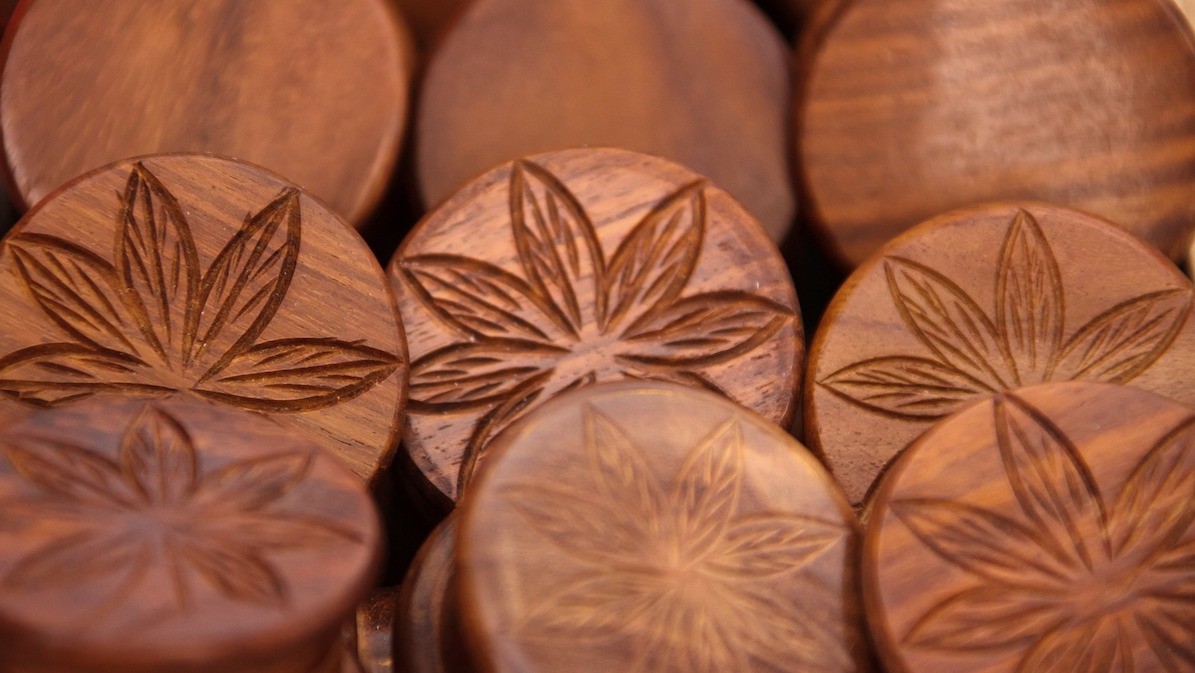
According to Statista, it is estimated that last year in the U.S. there were between 20,000 and 28,000 cannabis businesses. Currently 44% of logos registered as trademarks for cannabis businesses feature “The Leaf,” according to US Patent and Trademark Office records. Though only one of our top five jewels uses the visual, it serves as a leading example of using a common thread without being a cliché. With so little variation in such a new industry, it’s important for brands to remember that they need to market to a varied audience to instill brand loyalty for ganja consumers.
Want experts to help your cannabis brand logo stand out? Get a quote from the marijuana marketing specialists at The Cannabiz Agency.
DISCLAIMER: Cannabiz Digital does not sell cannabis. This publication covers business topics surrounding legal cannabis in California and the United States. It does not provide legal or medical advice. Consult your physician, lawyer, and local laws regarding cannabis. We do our best to provide current information at the time of publishing with no guarantees to accuracy. We understand this industry changes quickly and welcome your feedback. [Send Feedback]

Happy Highs: Cannabis Brands Find Success Marketing Joy and Well-Being
Cannabis makes you feel good. A simple yet powerful tool to market in the modern pandemic world. In 2020, how could consumers not be compelled to try for more joy, to seek happiness or some sort of relief from the chaos of the world? I want to feel good. I dislike feeling bad. The news cycle, with the pandemic and faltering economy, has gotten dark. Cannabis offers a ray of hope in these unprecedented times. When it comes to cannabis for depression, anxiety, PTSD,

Cannabis Marketing Amid Trump’s Social Media Battle
Trump’s executive order presents a major challenge for cannabis marketers who connect with customers through Twitter and Instagram. The bill could limit these companies’ ability to use social media in the same ways At this moment, the entire country is engaged in digesting the daily chaos of multiple crises. With everything that’s going on, it’s easy to miss some impactful changes. These changes could lead to difficult outcomes for those in the cannabis industry. In order to fully understand how to adapt,